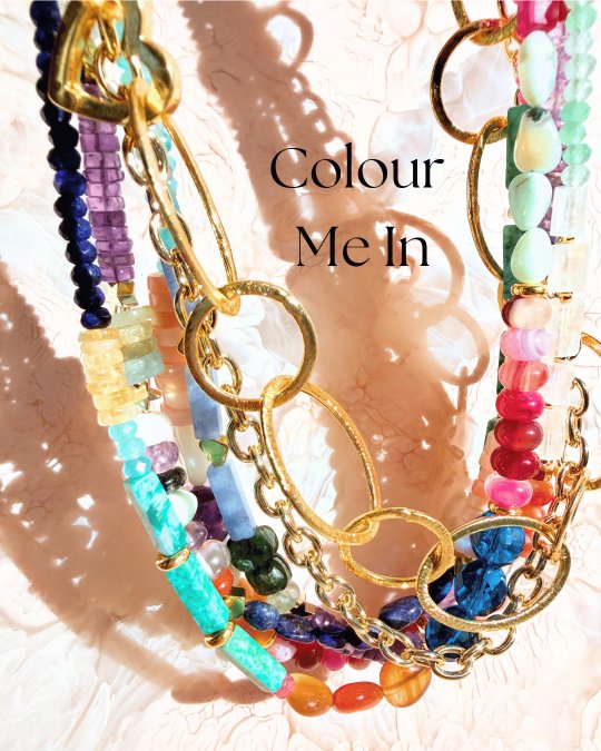
How to Use Colour Theory in Fashion Styling
Table of Contents
- The Colour Wheel, Without the Boring Bit
- Complementary Colours: Make Each Other Pop
- Analogous Colours: Effortless Colour Harmony
- Styling Colourful Jewellery With Neutrals
- How to Layer Gemstone Necklaces for Colour Depth
- Mixing Metals and Colours in Jewellery
- Style by Feeling, Not Just Theory
- Conclusion
- Frequently Asked Questions
Last Updated: September 25, 2026
The Colour Wheel, Without the Boring Bit
Colour is the fastest way to change an outfit- BUT you don't need a new wardrobe. You need one bold piece and the nerve to wear it.
At Sixth Dimension Gems, we believe colour is power. A life in colour beats a life in beige, every single time.
So here's how to use colour theory in fashion styling without turning it into homework.
The colour wheel has three layers:
- Primary colours: red, blue, yellow. You can't mix these from anything else.
- Secondary colours: green, orange, purple. Made by mixing two primaries.
- Tertiary colours: everything in between, like blue-green or red-orange.
That's it. That's the wheel.
The useful part is how colours relate to each other. Three relationships matter most for getting dressed:
- Complementary: colours opposite each other. High contrast, high energy.
- Analogous: colours next to each other. Calm, cohesive, easy.
- Monochromatic: one colour, many shades. Simple and strong.
Learn these three and you can style anything.
Complementary Colours: Make Each Other Pop
Complementary colours sit opposite each other on the wheel. Put them together and both look brighter. That's the whole trick.
Wearable pairs to try:
- Blue with orange
- Purple with yellow
- Green with red
- Turquoise with coral
You don't need to wear equal amounts. One colour does the heavy lifting, the other shows up as an accent.
This is where jewellery earns its keep. A lapis lazuli necklace against an orange dress does more than a whole second outfit would. The gemstone carries the contrast so you don't have to.
The biggest mistake people make is treating complementary colours as a matching exercise. They're not. They're a tension exercise. You want the two colours to argue a little.
Analogous Colours: Effortless Colour Harmony
Analogous colours sit side by side on the wheel. Think blue, turquoise and green. Or pink, red and orange.
These combinations feel calm because your eye travels between them without a jolt. Nothing clashes. Nothing shouts.
The catch? Analogous outfits can go flat if every shade is the same depth. Mix light and dark within the family. A pale moonstone next to a deep amethyst reads richer than two mid-tones ever will.
This is how to layer gemstone necklaces without overthinking it. Stay in one colour family, vary the shade, and let the strands fall where they fall.
Styling Colourful Jewellery With Neutrals
Neutrals aren’t boring when they’re used as a stage.
Black, white, cream, denim, camel and grey do one job brilliantly: they get out of the way. That's exactly what you want when the jewellery is doing the talking.
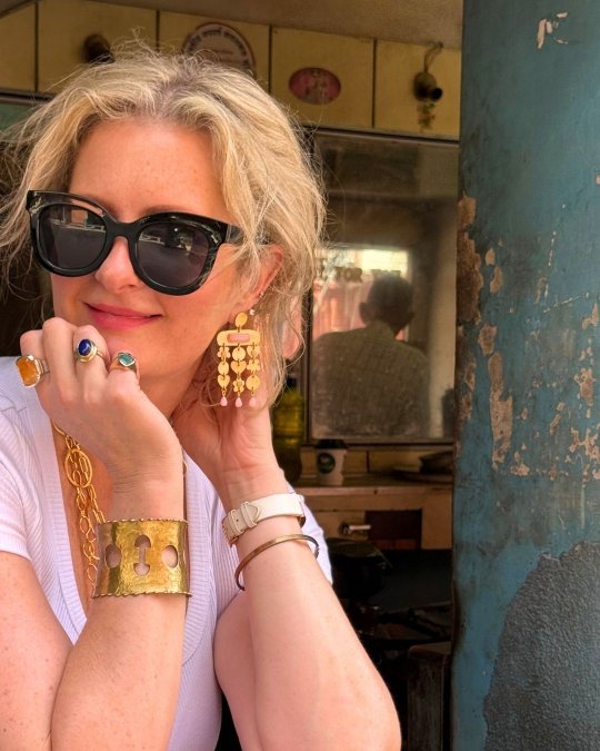
A plain white shirt plus one vibrant gemstone pendant equals a finished outfit. Swap the pendant for a beaded necklace and it's a different outfit. Same shirt.
Camel and cream warm up cool gemstones. Black makes them glow. Denim handles almost anything.
How to Layer Gemstone Necklaces for Colour Depth
Layering works best when each strand has a job. One long, one short, one that sits somewhere unexpected.
Three rules that actually help:
- Vary the length. Same-length strands tangle and compete.
- Vary the scale. Chunky beads next to fine ones look deliberate.
- Repeat one colour. A single shared hue ties mismatched strands together.
That last rule is the one most people miss. You don't need everything to match. You need one thread of colour running through the stack.
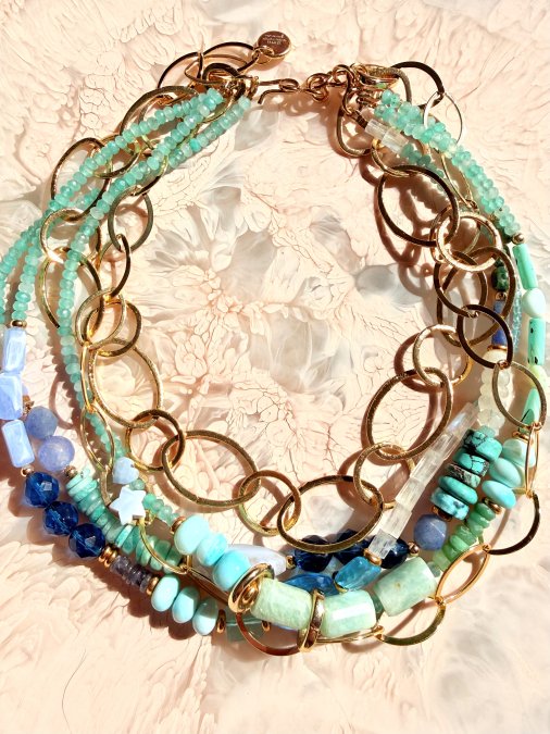
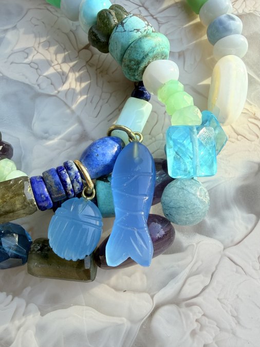
Our See You In Greece necklace does this with three strands of gemstones, including a hand-carved green chalcedony heart and a lapis lazuli heart. The greens and blues repeat just enough to hold it together.
Mixing Metals and Colours in Jewellery
Who decided jewellery has to match? Not us.
Gold and silver together look intentional when you commit. The trick is to repeat each metal at least twice so it reads as a choice, not an accident.
Same goes for colour. Mixing metals and colours in jewellery works when one element stays constant. Keep the gemstone family consistent and let the metals argue.
A few combinations that work:
- Gold-plated brass with warm stones like carnelian and amber
- Sterling silver with cool stones like moonstone and blue topaz
- Both metals together, with one colour repeated throughout
Our brass pieces are nickel-free, which matters if your skin is fussy. And yes, you can wear gold and silver on the same hand. Try it before you decide it's wrong.
Style by Feeling, Not Just Theory
Colour theory is a guide. It is not a rulebook, and it is definitely not a test.
The best-dressed women I know don't consult a wheel. They wear what makes them feel like themselves. Sometimes that's a colour clash that shouldn't work. Sometimes it's a single bold ring with an otherwise quiet outfit.
If a colour makes you feel joyful, confident or a bit powerful, wear it. That feeling is the whole point.
Conclusion
The hardest part of wearing more colour isn't the theory. It's the permission.
So here it is: you don't need to match perfectly. You don't need to be young, or thin, or have somewhere to go. You need one piece you love and the willingness to wear it.
Sixth Dimension Gems makes hand-beaded and gemstone pieces designed for exactly this. Every piece is designed by artist Louisa de Haas and crafted by master artisans in Jaipur, with many beaded designs made by hand in her Southern Highlands studio. They're built for layering, mismatching and wearing your own way.
Choose what you love. Layer freely. Wear joy.
Frequently Asked Questions
How can I use the colour wheel for fashion styling?
Start with one relationship at a time. Complementary colours sit opposite each other and create contrast: blue with orange, purple with yellow. Analogous colours sit next to each other and feel calmer: blue, turquoise and green. Monochromatic means one colour in different shades. Pick one relationship, build your outfit around it, then use jewellery to reinforce or disrupt it.
What are the best colour combinations for jewellery and clothing?
There is no single best combination, but some work reliably. Warm gold-plated brass against cool blues and greens creates tension that reads as intentional. Amethyst and lapis lazuli layered together give you purple and blue, an analogous pairing that feels rich without matching. A turquoise or green stone against a camel coat is a classic complementary move.
How do I mix colours in my outfit without looking messy?
Anchor the outfit in a neutral, then let the jewellery carry the colour. One bold piece does more than three competing ones. If you want to layer, keep the gemstones within one colour family, or pick two colours that sit opposite each other on the wheel and repeat both. Repetition is what makes a clash look deliberate.
Can I wear contrasting colours if I prefer a subtle look?
Yes, and jewellery is the easiest way to test it. A single complementary stone against a neutral outfit gives you the contrast without committing your whole wardrobe. Start with one piece, see how you feel, then add a second in the same colour family. Contrast does not have to mean loud.
Ready to stop dressing in beige? Start with the Colour Me Happy bracelet or the High Tide necklace, both built for stacking and clashing. Explore the full collection and find the piece that feels like you.
Colour Me Happy